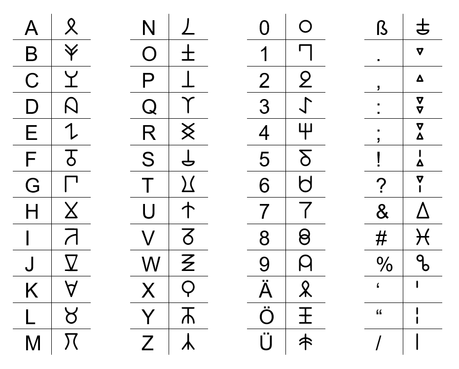
This monoalphabetic substitution alphabet was inspired by the Zodiac Killer’s cryptograms. If you are not familiar with them, in addition to the Latin alphabet, he used several symbols, such as triangles, half-filled rectangles, and mirrored letters. While his cipher was homophonic to throw codebreakers off, meaning that one plaintext letter could have more than one representation in the ciphertext, my goal was simply to form my own “secret” alphabet.
I drew further inspiration from Greek, ancient Egyptian, Nordic runes, and various symbols I found online. The goal was to have each letter be aesthetic, original, yet vaguely familiar, and quick to write. To help myself memorize them, I created mnemonic devices for most letters. For example, the “C” looks like a chalice, and the “F” like a mirrored five. In fact, I made and memorized the letters in one evening, only changing details afterward. (The “N,” which obviously resembles a nose, took three iterations because it is so common that its appearance changes that of the entire ciphertext. Coincidentally, it looks somewhat similar to the Korean “N.”)
Memorizing and writing the letters was one thing, but reading them is an entirely different story because we are used to reading words as a whole. To get more practice, I decided to make my own font, “Caidoz Standard,” in Calligraphr. As I was not too comfortable with smearing things down with a pen and then embedding it forever in C:/Windows/Fonts, I used my tool of choice instead, PowerPoint, and made the letters as neat and simple as possible. No serifs, no swirls, no ligatures.

Since I was already at it, I also developed numbers and a variety of symbolic characters because I found the blank boxes quite annoying whenever I translated an existing text with punctuation. Therefore, I formed as many combinations of tiny strokes and triangles as I needed to cover most of the keyboard. I even added German umlauts that are based on their unumlauted representations.
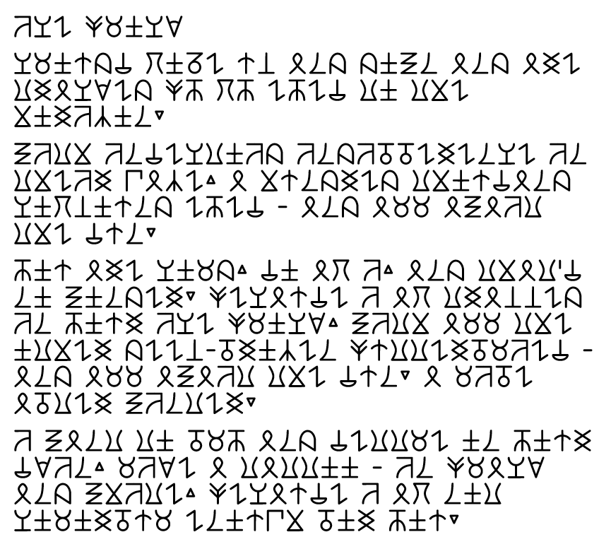
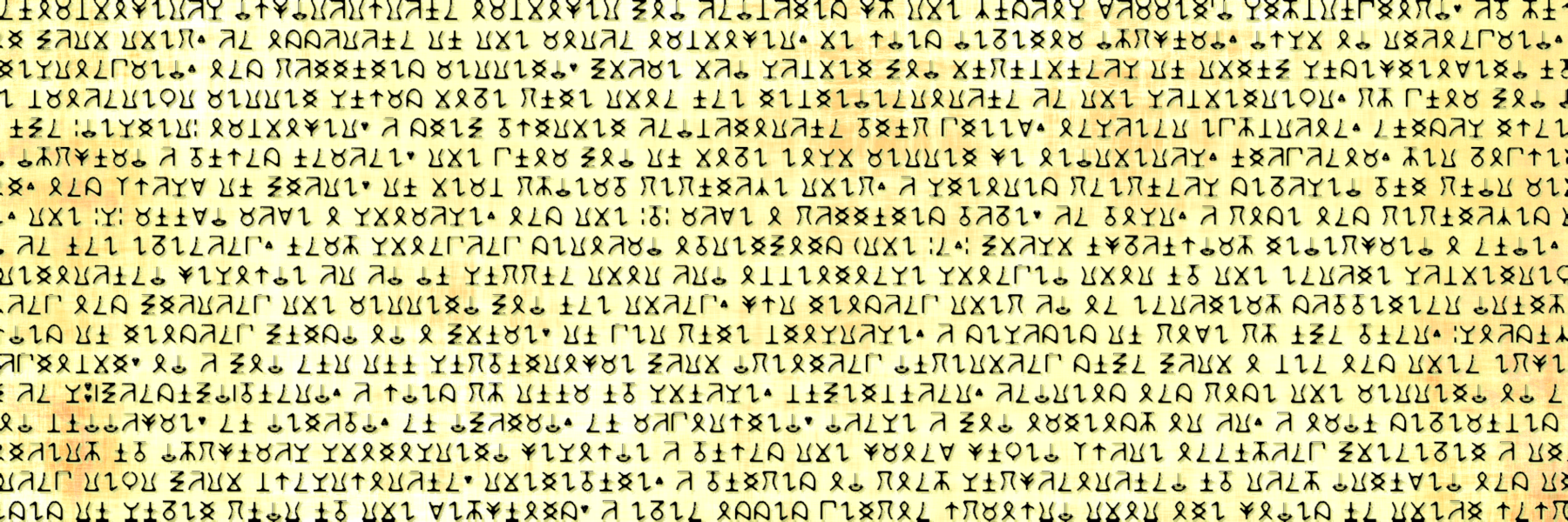
Below you can find an example of the Caidoz typeface. I will spare you the plaintext this time but invite (if not challenge) you to translate it and memorize the characters yourself.

If you want to use Caidoz as a font on your own device, you can download it from the Hidden Vault using the code caidoz.


Leave a Reply